the NachtKabarett

All Writing & Content © Nick Kushner Unless Noted Otherwise
|

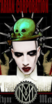
EARLY LOGOS & DESIGNS | Early referential logos and designs of Marilyn Manson, spanning from 'Portrait of an American Family', 'Smells Like Children' and prior to the band's national signing to Nothing Records in 1993. Included to follow will be scans of original earlier fliers, Marilyn Manson mailing newsletters and early drawings by Manson.

 |
|
THE CHURCH OF THE ANTICHRIST SUPERSTAR EMBLEM | Originating in 1995 and carrying over until 1997 on various fanclub newsletters, t-shirts and other designs, Manson adopted a parodied mock-religious logo to represent his self-styled "Church of the Antichrist Superstar" preceding the dawn of the album's release.
As the album title 'Antichrist Svperstar' is in effect a derisive parody of the 1970 concept album 'Jesus Christ Superstar' Manson's logo for this era, along with the Shock symbol, was a direct reference to the cover art of the album name he reinterpreted, with the Manson lightning bolt juxtaposed within the center for further inversion and personalization.
|


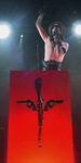
ANTICHRIST SVPERSTAR SHOCK SYMBOL | The most infamous and synonymous of all of Marilyn Manson's logos and signets, the Shock symbol of 'Antichrist Svperstar'. The references within Manson's adoption of this symbol are vast and far reaching, which extend to the occult, David Bowie, Anton LaVey and Satanism, Nazis usage of similar symbols, to as simple as the lightning bold being the universal symbol of electric shock ; apropos for the New Millennium's most notorious and controversial "Shock Rocker"
 |
MECHANICAL ANIMALS OMĒGA SYMBOL | "'I am the Alpha and the Omega,' says the Lord God..." Revelation 1:8 ; The Beginning and the End.
At the dawn of the album's release, Manson stated that the incarnation he embodied during the 'Mechanical Animals' era was to represent the final stage of evolution which he was to assume. Omega is the last letter of the Greek alphabet and is the centuries old symbol which signifies 'The End', or the Apocalypse if viewed in a Biblical context.
 |
|


THE LAST TOUR ON EARTH - TV CROSS | "Marilyn Manson, the great rock singer, saw a photo of this scene, I suppose, and used it at a music festival. He used this cross. The scene of the millionaire's son was taken out because we feared it might be considered as child abuse, as pedophilia." (Alejandro Jodorowsky 'The Holy Mountain', deleted scenes commentary.) KKK etc quote Astonishing
HOLY WOOD, MERCURY & THE ANDROGYNE | The identity which Manson adopted during 'Holy Wood', as well as the Triptych containing its predecessors 'Mechanical Animals' and 'Antichrist Svperstar'. Mercury is the key element in alchemy which is said to yield the fabled Philosopher's Stone and is the planetary element which bears the influence of artistic and poet flair. Its equivalent in Greek mythology is the God Hermes who is known as 'The Messenger of the Gods'. The Androgyne is a symbol of alchemical balance, Male & Female; Black & White; Marilyn & Manson, and thus a symbol of the transformation and evolution which The Triptych represents.
 |
HOLY WOOD ERA GUN CRUCIFIX | "Do you love your guns, your god, your government?" as Manson scathingly indicted on 'The Love Song', against the ideals America holds above all else. The three tools it uses to justify its bigotry, blind-hatred and bloodlust. The gun crucifix symbol which Manson adopted during the 'Holy Wood' era symbolizes that very theme of, literal, violence worship by combining three guns into a symbol of universal worship, the central arm of which is styled after the rifle used to assassinate Kennedy whom America has historically valued as a martyr, or Second Christ, via his very public death. The type of death which both makes the aggregate public reel in horror, and conversely enthralled to complete absorption and consumption of tragedy.
|
GOLDEN AGE OF GROTESQUE DIAMOND | The symbol of The Golden Age of Grotesque era is a regular black rhomb with a double white border against a black background, the outer border is thicker than the inner one. There are two stylized white capital M letters inscribed within the rhomb.
Aside from the SS insignia the specific outline of two M letters goes back to the Nazi Eagle, one of the main symbols of fascist Germany that embodies strength, power and might. In this context, by viewing the Marilyn Manson MM as representative of two eagles this is not-accidental connotation, as in alchemy the double eagle is a sign of Androgyne; Mercury.
RODENT DEATH'S HEAD | Alternate logo utilized onstage and accompanying tour program of 'The Golden Age of Grotesque'. The inversion of the traditional Nazi SS styled death's head amalgamated with a familiar pair of cartoon rodent ears. An extension of the artistic collaborations with controversial artist, Gottfried Helnwein, this more incendiary logo does in turn represent the very satirical themes Manson wished to portray throughout the album and era.
 |
|


PERSONAL JESUS | Though a Depeche Mode cover, Marilyn Manson's video for 'Personal Jesus' contained many references which began with a new logo on the single cover, its accompanying artwork and even down to the apocalyptic imagery within the video for the song itself.
Additionally, Depeche Mode; the Four Horsemen of the Apocalypse; the legendary slayer of the dragon (ie - Satan), St. George; false prophets; and evangelical profiteers are all present within the one and only single from 'Lest We Forget'.
 |
|


DOUBLE-CROSS - THE CELEBRITARIAN SYMBOL | Celebritarianism. Celebritarian.com was (temporarily) resurrected from the dead in October of 2005. The sole symbol which the website consisted of is a double barred cross, often known as The Cross of Lorraine. It's a symbol that has connotations in the occult, alchemy as well as freemasonry, all of which have been underlying, reoccurring and key elements throughout Manson's art.
First hinted at by its implied formation on the cover of the unreleased 'Holy Wood' novel, it is a symbol which has been consistently referenced by Manson since this date and is additionally found within the cover artwork of 'Eat Me, Drink Me'.
 |
MARILYN MANSON / CELEBRITARIAN CORPORATION LOGO | Though evidently aborted for use upon the release of 'Eat Me, Drink Me' in 2007, this logo which never rose to full fruition was the central piece to the montage that was the official Celebritarian Corporation masthead which Manson conceptualized to embody the era and art movement he had been cultivating between 2004 to 2006.
Outlined in the following is a breakdown of each element of the collage with all that can be inferred about it and the logo with its minimal use and release, which were all amalgamated and assembled together to embody the ethos of Celebritarianism, with each piece a representation of the themes Manson wished to portray.
 |
EAT ME, DRINK ME TWISTED HEART LOGO | A new direction for Manson emerged in the events leading up to the release of 'Eat Me, Drink Me': the cryptic elements from MarilynManson.com became less prominent, and has since been replaced with a new twisted heart icon, altogether seeming to shift towards a more raw, emotional & subjective examination of admittedly his most difficult year yet.
This particular heart however find its origins within a 1920's horror film of a perverse love gone awry...
|


EAT ME, DRINK ME - VAMPIRE FANGS LOGO | Though not particularly esoteric or heavy symbolism, the primary 'Eat Me, Drink Me' Marilyn Manson logo (as opposed to a symbol denoting the themes of the album/era, such as the Mad Love heart signet) were two blood dripping fang-like M's to represent the initials of the band. Fairly self explanatory in representation, and included here for the sake of being all-inclusive, the dripping red M's are nonetheless an iconic logo in themselves and work effectively in illustrating the many vampiric themes of the album.
 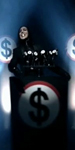 |
THE HIGH END OF LOW - PRETTY AS A $ | As its title would suggest, Arma-Goddamn-Motherfuckin-Geddon' contains numerous parallels to Biblical iconography. These themes, among others, pervade the song and video for the single, exploring the innate fascism of money, censorship and sensational of American culture. One of the most indicting tracks on the record with the single's video and imagery acting as a prelude to the new era's ethos. The new $ symbol with the video acts additionally as a veiled reference to Salvador Dalí, stemming from a pointed attack formulated on Breton's belief that Dalí had abandoned his artistic integrity and surrealist roots in the pursuit of fame and wealth. Furthermore, (and much like Manson) Dalí was met with accusations of being a Nazi sympathizer who held militaristic and fascist ideologies, due to his unashamed and open fascination with fascism.
 |
|


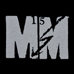
M/M 15 - MAR1LYN MAN5ON & NUMEROLOGY | Manson's first predominant evocation of numerology first reared its head throughout 1996's 'Antichrist Svperstar' era but it wasn't until 'Mechanical Animals' that numerological correspondences became obvious within his works. Namely, the number 15, which can be found consistently throughout Manson's works ever since..
The number 15 resurfaced prominently during The High End Of Low era with an eponymous track title, as well as a "Mar1lyn Man5on" logotype on the single 'We're From America', accompanied with a new logo on the back made of two rough Ms interconnected by a shock symbol, each bearing a 1 and 5 within them. The logo also appears on the back of a shirt from the era, while Manson signs most of his web correspondence with a "M/M 15".