the NachtKabarett
All Writing & Content © Nick Kushner Unless Noted Otherwise
Collaboration with Gilles R. Maurice
By associating the band's initials with the main themes of the era, these iconic blood dripping fang-like Ms carry on what was initiated with The Golden Age of Grotesque and its eagle-shaped Ms, the Lest We Forget gothic Ms as well as the Celebritarian MMC occult seal. Indeed this very uncommon and abstract logo subtly plays with sharpened and dynamic shapes as well as unusual physical properties to render a complexity of symbolisms related to the album's several directions : blood ritual and slaughter, Alice's journey in Wonderland, Biblical symbolism, and of most obviously Vampirism.
 |
 |
 |
 |
 |
|||
| Click thumbnails for each connection of the Nails Logo. | |||||||
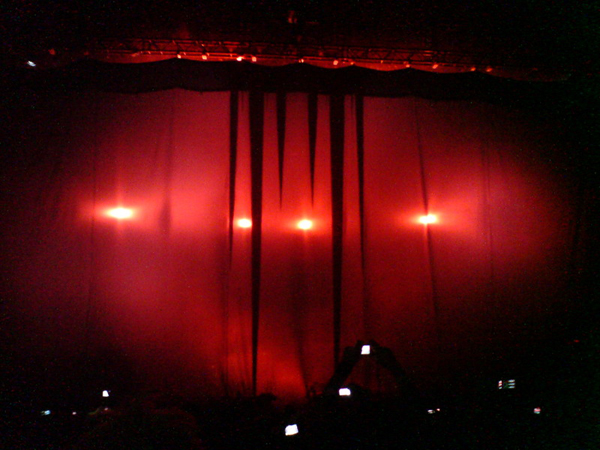
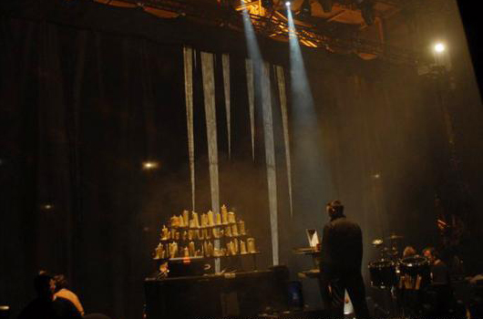
 The 'Eat Me, Drink Me' bloodied fangs logo which hung in front of the stage before each performance of the band's 2007-2008 'Rape of the World' tour. The 2007 leg of which began with Manson singing the album's gothic anthem 'If I Was Your Vampire', where the curtain would fall to reveal the band amidst the ornate gothic stage decor of fog and candelabras. Notice the resemblance with red painted M present on the poster for Fritz Lang's M previously borrowed by Manson.

The trees in the courtyard are painted in blood, so I've heard.Marilyn Manson, Eat Me, Drink Me
She hangs the headless upside down to drain.
Eat Me, Drink Me
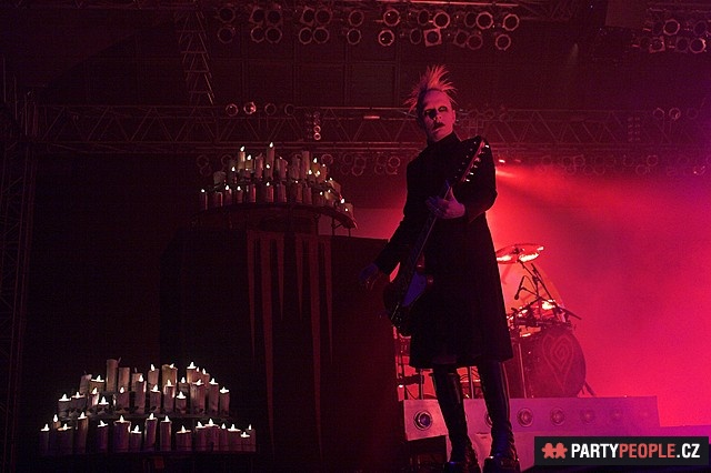 Tim Skold onstage during the Summer 2007 leg of 'The Rape of the World' tour, with a prominent display of the gothic stage decorum of candelabrum, projections of the moon and backward winding clocks, bleeding red M's along with some of the most dramatic ambient lighting of any past Marilyn Manson tour.
At first sight, the color and shape evoke liquid blood dripping down a wall, or an altar. A feeling emphasized in the splash panel for MarilynManson.com, where the blood progressively spills down to reveal the Ms, and more subtly on the album cover on which it is inevitably associated with the blood dripping from the window on the main photograph. Besides this warm, liquid interpretation, the sharpened downwards peaks can also be seen as solid cold stalactits in an obscure cave, a Vampire den or a cold hellish place (which is somehow reminiscent of the song title 'They Say That Hell's Not Hot'). These two antagonist perceptions of a dripping altar and bloody stalactits are emphasized by a curious particularity of the logo, which is the absent/minimized space above it, yet another feature that makes this logo quite unique when compared to the majority of existing logos, most of which are drastically wrapped in a consequent empty square around them, for better visual impact of the brand. The blood painting can also be seen as Manson's sick interpretation of the passage from Alice in Wonderland in which the Queen's white roses are mistakenly painted in red, causing decapitation of the tactless decorators.
 Screencapture from Disney's Alice, when the Queen of Hearts notices her beautiful white roses have been painted in red by mistake.
 Fuck me 'til we know it's unsafeMarilyn Manson, Evidence
And we'll paint
Over the evidence
Eat Me, Drink Me

The most evident interpretation of the logo remains a set of dramatically stretched blood dripping vampire fangs, illustrating the many vampiric themes of the album. Vampire references which range from the metaphorical devouring of Christ in the New Testament, the connotations of David Bowie's role in the fatal-romantic vampire film The Hunger, to as obvious as Manson's celebrity status as the modern day Dracula or vampiric demagogue in pop culture today. The allusion was emphasized on the website splash panel and during the Rape of the World tour, as the apparition of the logo on the curtain was combined with the introduction of the album first song : the gothic ballad "If I was your Vampire".
 |
 |
 |
Three amongst the major cinematographic influences for the vampire/horror themes and aesthetics of the Eat Me, Drink Me era, which present on their respective posters several elements reminiscent of Manson's logo, notably the blood lettering. |
||
The stake-like bloody shapes give a whole new dimension to Manson's identification to Vlad the Impaler, which will be repeated during the Rape of the World Tour's projections, with a field of Double Cross-shaped stakes on a red background. The subtlety of these metonymous vampire fangs drawn with blood reflects Manson's preoccupation of prominently alluding to the vampire theme while nevertheless avoiding explicit, evident or cliché vampiric depictions, and thus willingly adopting the label of modern days Nosferatu without proving his critics right.
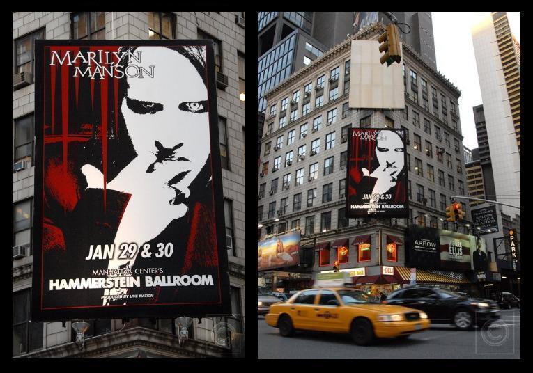 January 2008 New York City promo display for the Winter leg of 'The Rape of the World' tour, with Manson depicted in a manner befitting a modern-day Nosferatu.

And I don't mind you keeping me on pins and needles.Marilyn Manson, Heart-Shaped Glasses (When The Heart Guides The Hand)
If I could stick to you and you could stick me too.
Eat Me, Drink Me
 |
 |
Left; various traditional depictions of the Three Nails, with and without crown of thorns. Right; a similar depiction with inverted nails configuration (which also evokes Crowley's Alphabet of Daggers), used as a preview window within an alternate menu design from the Lest We Forget DVD. |
|
A less obvious reference, nevertheless confirmed by the official name it was assigned in the merchandise website, the Nails Logo, is the allusion to the Holy Nails, or nails of crucifixion. Often represented by three, and most of the time associated with the crown of thorns, the nails are often used in Christian imagery to represent the Christ's passion, to which we can assimilate to the sensation of 'pins and needles' (or paresthesia) Manson describes, provoked by another kind of 'passion', a sensation directly evoked by the sharpened red shape on obscure background, through a quasi-synesthetic process (colors, shapes, emotions and sensations are associated in their perception).
 T-shirt issued in 1997 during the Antichrist Svperstar era, displaying an improved version of the earlier Church of ACS logo, as well as a complex graphic work on the back containing the exact same inverted nails and crown of thorns depiction that would later be used for the Lest We Forget DVD.
Materializing the Biblical connection present in the album's title while emphasizing its intrinsic violence, the logo marks a further step in the process of identification to Christ. Crucified in the Coma White video, rotting on the cross on the Holy Wood cover, and exhibiting the stigmata of his resurrection in the Personal Jesus video, Manson now erects his own enlarged relics side by side, the instruments of his torture still dripping in blood, exposing them to the audience and mass media, and signifying his ultimate sacrifice, pain, passion, resurrection, and access to a Christ-like icon status.
Sorry your Sunday smiles are rusty nailsMarilyn Manson, Target Audience
and your crucifixion commercials failed.
Holy Wood
Interestingly on most representations the nails go through 'Marilyn' and 'Manson', litteraly sticking him, which also reminds of the traditional stakes used to stab vampires. Even though only two nails are displayed here, the number three is still very present, notably with the three downward pikes formed by the nail and the blood dripping down from each edge of is head shaping the two Ms.

6 a.m. Christmas morning. No shadows, no reflections here.Marilyn Manson, If I Was Your Vampire
Eat Me, Drink Me
 |
 |
"And certainly the glass was beginning to melt away, just like a bright silvery mist". Alice leaving reality to enter the Looking-Glass House on an illustration by John Tenniel from the eponymous book's first chapter. A perfect illustration of Carroll's and Tenniel's symetric geniuses. Notice the similarly mirrored 'JT' monogram as well as the hatched texture the logo reproduces. |
|
Not unlike the previously used Double Cross (the meaning of which is echoed in the album with the song title "You and Me and the Devil Make three"), the two mirrored Ms once again illustrate the dichotomy Marilyn/Manson, Eat Me/Drink Me. Reunited through an unusual symetry, these two imperfect entities altogether shape a third, more complete one, which is reminiscent of the omnipresent theme of love (to death) relationship, and finding one's other half.
The mirror aspect suggested by the mere central symetry can relate to both Carroll's Through the Looking Glass, as a door/curtain to alternate realities, and the vampire theme with the fact that the nocturnal creatures allegedly can't see themselves in mirrors, but also to Manson's own mythology, notably with the Antichrist Svperstar song 'The Reflecting God'.
I see my horror mirrored in the sundown of your blank stare.Marilyn Manson, Eat Me, Drink Me
Eat Me, Drink Me

 |
 |
"Curiouser and curiouser" ; Alice's transformation after she ate the 'eat me' annotated cake (right) which gives her the ability to grow, on the original Tenniel illustration, and a vertically stretched version of the Nails logo on a web image announcing the album's release date (left), the peculiarity of which seems to be directly derived from Alice's experience. |
|
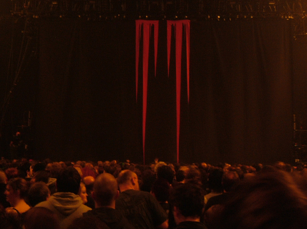
The dramatic proportions of this oversized logo are following the tradition of Manson's habitual gigantic curtain games and expressionnist/mock-fascist distorted imagery, and go even beyond, as these terrifying marks of the devil transcend the whole vertical length of the curtain, imposing power and domination upon the whole crowd with no limits whatsoever. This gigantism is balanced with an opposite impression of abyssal depths, hellish underworld, light deprivation, which is reminiscent of the Biblical 'Bottomless Pit' (or Rabbit Hole?) alluded to in the Antichrist Svperstar song 'Little Horn'. It can also evoke the depths of depression and darkness of love deception and loneliness recently experienced.
 Frame showing Alice growing from the Disney version of the tale. Notice the vertical kinetic lines which emphasize the feeling of sudden growing already rendered in the animation, especially the eyes and mouth areas...
A dynamic of elevation is also perceptible, evoking resurrection, empowerment and self-realization. Indeed, opposed to the blood's downward direction, a brutal upward kinetic force can be felt, the vertical lines likening the symbol to a comic-book-like representation of movement, leap, takeoff, only to swoop down on an unfortunate prey. Manson's aura rises from the stage much like his own incarnation of the Third Beast rising from the sea in the Disposable Teens video, his Christ-like elevation during his Cruci-Fiction in Space performance on the Guns, God & Government tour, and eventually his performance on The Reflecting God during the Rape of the World Tour, with a similar platform trick dissimulated with smoke which now relates to Alice's sudden growing when she eats, and Manson's own elevation by love. This logo is thus also a synesthetic representation of love (elevation/high) to death (blood dripping down/low).
 Study on the logo's capacity to shrink/grow vertically, which makes it a very uncommon representation both in its conception and the way it's used. While the maximized vertical size can be more likened to the Nails of Crucifixion or a bouquet of sharpened daggers, a total shrinking reveals perfectly distinguishable vampire fangs, the logo is thus an illustration of their canines retractability, and more broadly an appropriation of these creatures' prodigious capacity of transformation.
Another characteristic of this logo is even more evocative of Alice and her ability to shrink or grow when she eats or drink things : depending on where it's printed, it can be enlarged only by stretching it vertically (such as what has been done on the web image presented above which announced the immincence of the album's release). Indeed, while a majority of logos undergo very drastic style guides which make alterations impossible, and enlargements necessarily homothetic to preserve proportions, this one infringes the golden rule with its peculiar property to shrink or grow vertically, depending on where and why it's used, which seems to be directly derived from Alice and her changing of proportions whether she eats or drinks the annotated items. This theme of transformation is thus well present once again, and is perhaps the logo's characteristic that applies most to Manson's whole body of art since his beginnings. From this point of view it is very close to the Mercury logo, particularly when you also consider its solid/liquid aspects previously discussed on this article.
These antagonist properties, dynamics and feelings of gigantism/depth, rising up/dripping down, contraction/expansion, high/low, solid/liquid are in perfect continuity with the Eat me/Drink me, Marilyn/Manson, and Lewis Carroll/Charles Dogson dichotomies, and obviously with Alice's own duality. The very balance between 'high' and 'low' is also reminiscent of the Celebritarian Double Cross' aspect and signification (As Above, So Below), as well as the description of Manson's feelings in the song Heart-Shaped Glasses: "Getting me High, Making me Low"...